“The home is the story of who we are. Told through the things we provide space for and the colors we surround ourselves with.”
Lisbeth Larsen, Jotun
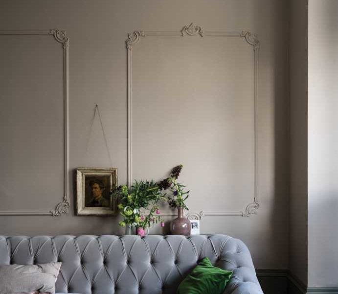
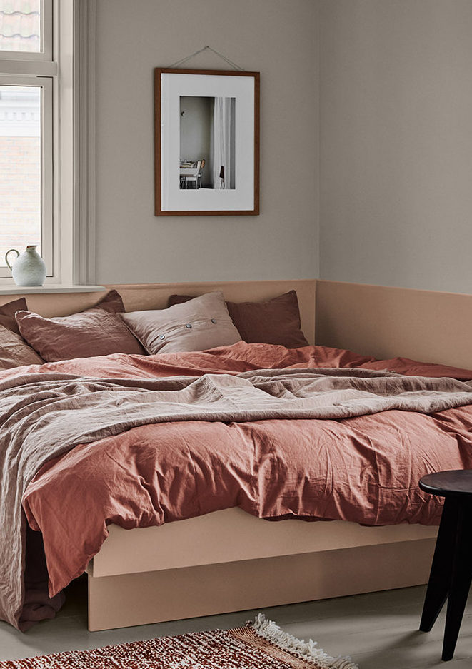
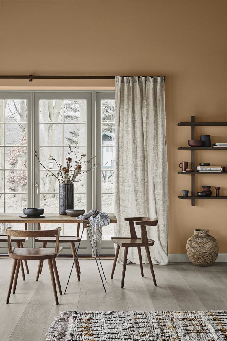
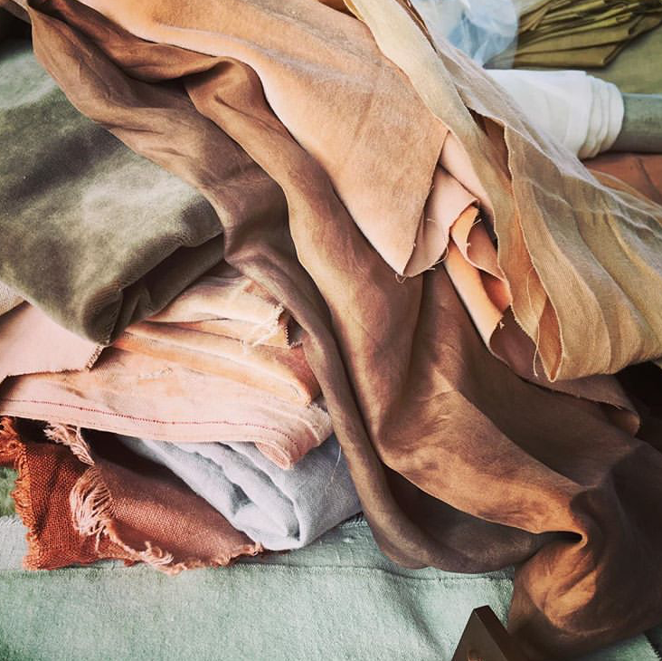
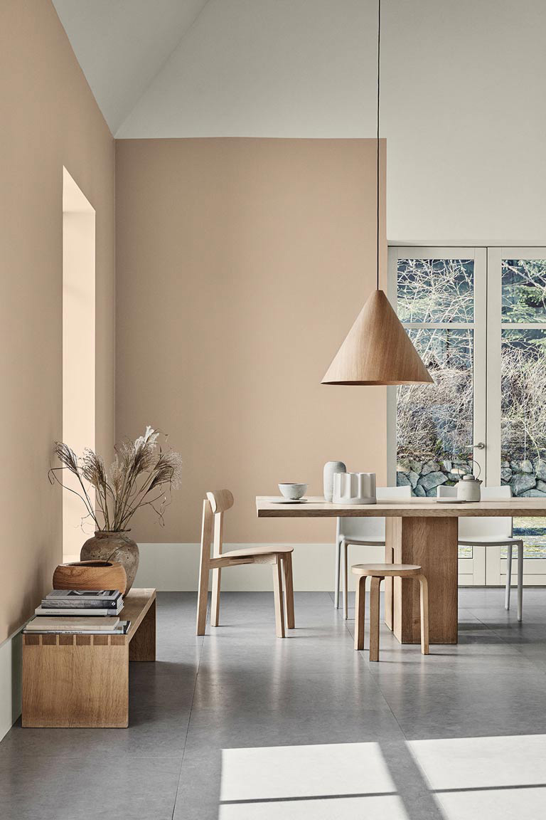
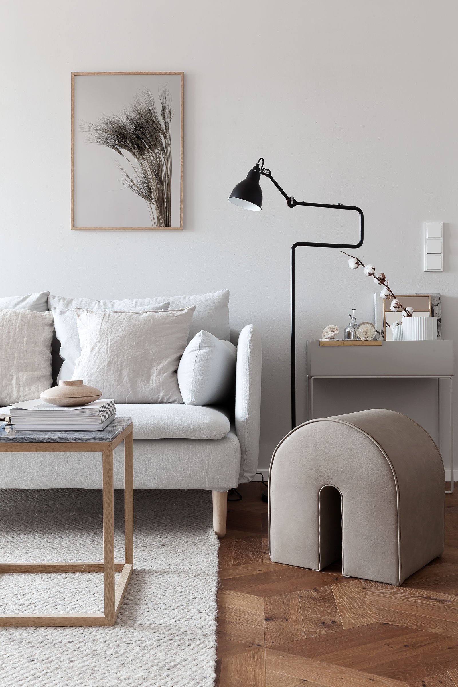
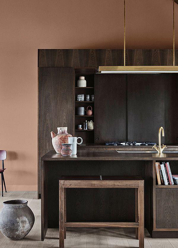
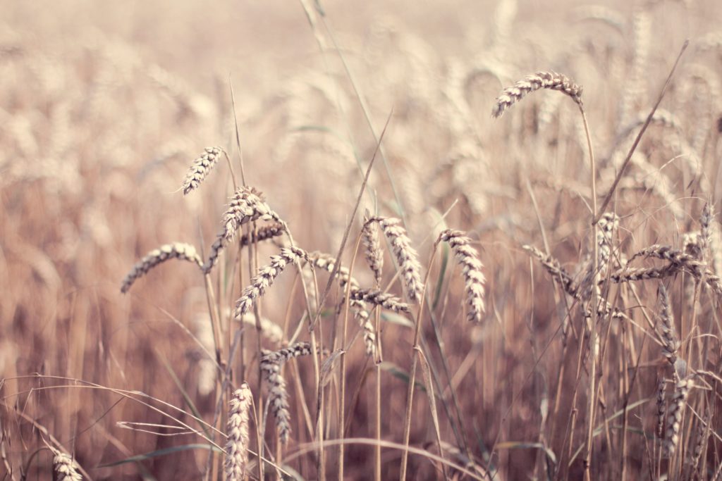
We are gradually turning towards warmer tones in the space around us. We are moving away from the very many shades of grey that have underpinned the prevailing cool neutral palette in recent years, in favour of a welcoming palette with underlying earthy pigments. The comforting ‘new neutrals’ include interpretations of oatmeal, stonewashed linen, dusky pink, soft pastel peach, and mellow mushroom.
Where I was previously turned off by beige, (even the word makes me feel a bit bleugh), I find myself drawn to the natural effortlessness of the colour, especially when it is paired with a hint of spice, terracotta, dark chocolate or burgundy. To me, the look has a laid-back, soft focus, layered retro 1970s feel, which I am all for channelling.
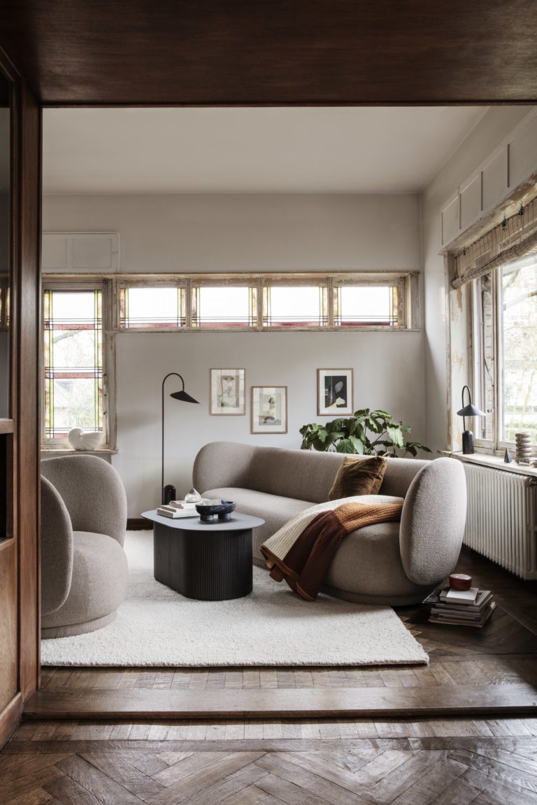
New neutrals, soft lines, curves, volumes and warmth at Ferm Living
I am not the only one to experience this turnaround, which brings me to wonder what has brought us here – essentially to a chromatic manifestation of the earth element – our source of grounding, support and stability. Earth is synonymous with the root chakra or ‘muladhara’ in Sanskrit, the first of the seven centres of energy within our subtle bodies.
The root chakra represents our place on this planet and our connection to the earth, where we receive our sense of safety, survival and nourishment. Each chakra has a colour that it is associated with, the colour of the root chakra is red and I don’t think it is a coincidence that many of the new neutrals warming our homes have red undertones.
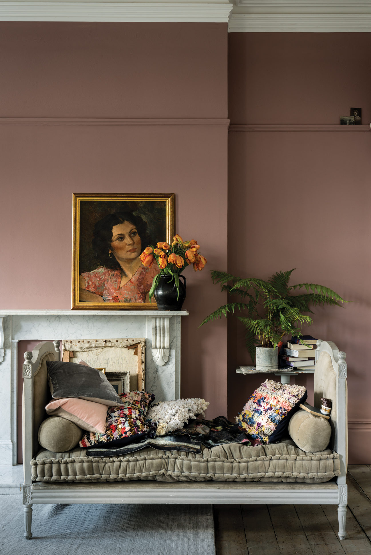
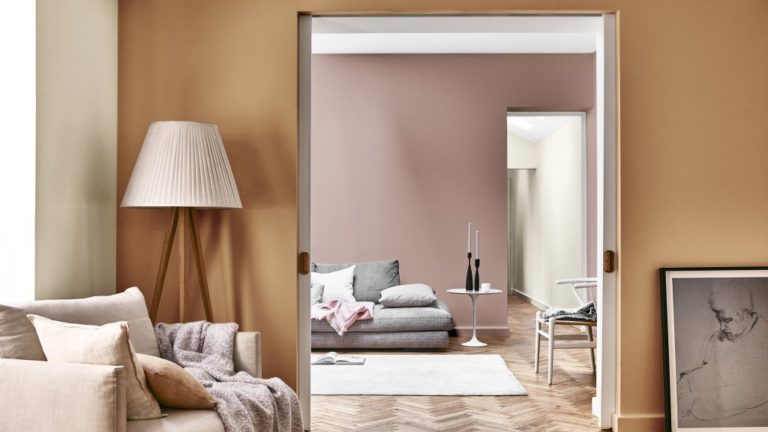
Sulking Room Pink by Farrow & Ball
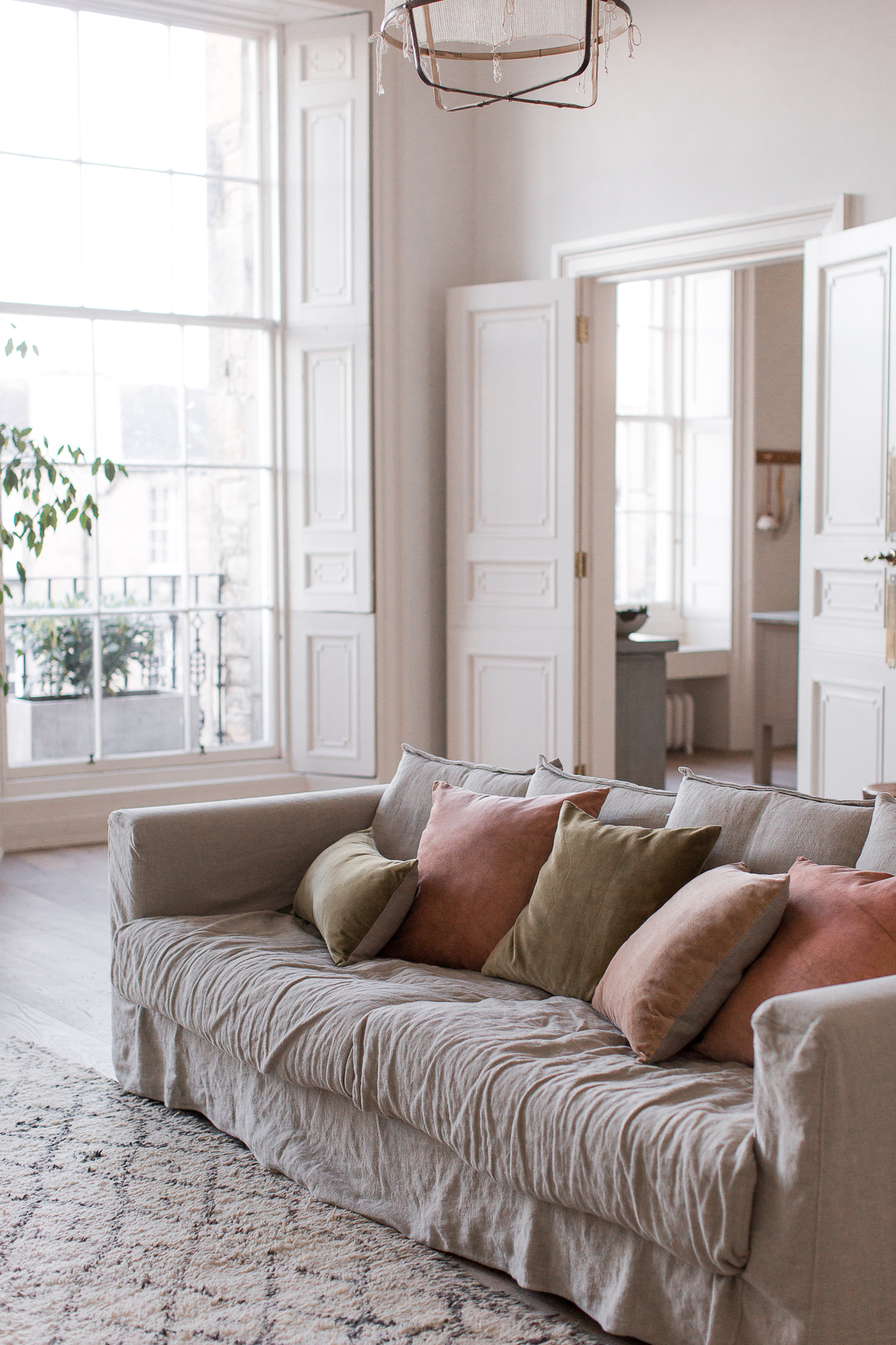
Muted warm tones in the living room in the apartment/studio space of Ingredients LDN
With the current global political climate and continuing instability in mind, it is no wonder that we feel unsettled and anxious – the exact same symptoms of an out of balance root chakra. As a result, we are looking to our homes for cocooning comfort, a safe place to retreat where we can shut out the uncertainty in the world outside and reconnect with ourselves.
This is something that Farrow & Ball Colour Consultant Joa Studholme made reference to in an interview with ELLE Decoration, “In times of international turmoil, we all tend to gravitate towards warmer red-based colours that make us feel like we are being given a great big hug and make us forget about the world outside.”
Jotun's 2019 Calm colour theme
Dulux’s Colour of the Year 2019 ‘Spiced Honey’ is also touted for its restorative properties. Described by Marianne Shillingford, Dulux UK’s Creative Director as being “inspired by the varied tones and remarkable properties of honey — natural, timeless and enduring, protective, rejuvenating and healing”.
Although I haven’t rushed to paint my walls in the hue yet, it is true that honey is nature’s sweetest nectar, or ‘soma’ in Sanskrit. The word ‘soma’ represents an extraction of the juiciness, the good stuff, that which feels supportive and calming, undoubtedly helpful in balancing a backdrop of national and global divisiveness that purportedly lies outside of our front doors.
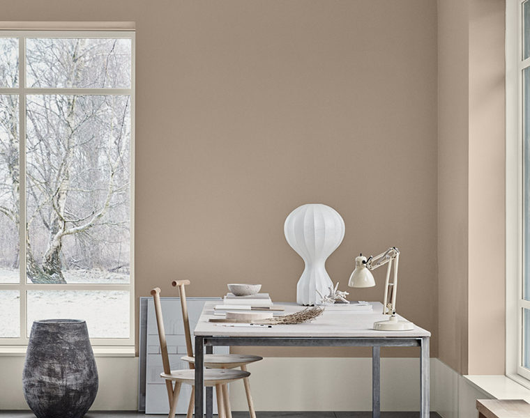
Spiced Honey, Dulux 2019 Colour of the Year
On a lighter note, it is one of Farrow & Ball’s new ‘brown-based neutrals ’Jitney’ that happens to be one of my favourites. To me it is comforting, warm and cosy but light enough to feel refreshing and perhaps it is this balance that is required for the widespread use of earthy tones which also complements a cooler, grey palette (that many of us already have in place!) It was named by Farrow & Ball, “after the bus that whisks New Yorkers out of the hot city to the similarly coloured sandy beaches of the Hamptons”. Take me there!
Jitney by Farrow & Ball
Norwegian paint company Jotun, has also picked up on a quest for warmth in its three 2019 colour themes that relate to calm in simplicity (Calm); a collective journey inward for self-expression (Refined); and a connection with nature to provide the reassurance of being rooted (Raw).
For me, these layers create the story of what we are yearning for and the magic lies in ‘Raw’. This is the theme that provides the deeper accents to create modern rustic spaces that are in Jotun’s own words, “easy on the eye and stirring to the soul…a contemporary, boldly feminine palette balances rawness and refinement, the hand-crafted and clean-lined modernity.”
Jotun’s Raw colour theme inspiration
Jotun’s Raw earthy colour theme
Jotun's 2019 Raw colour theme
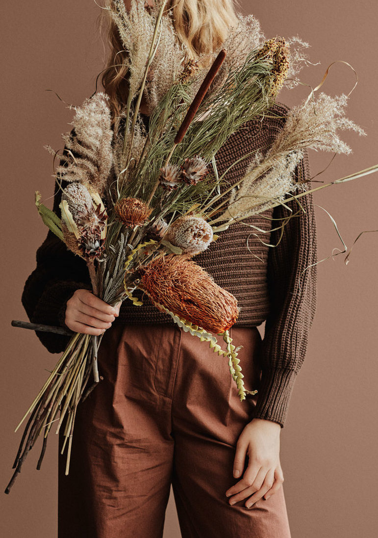
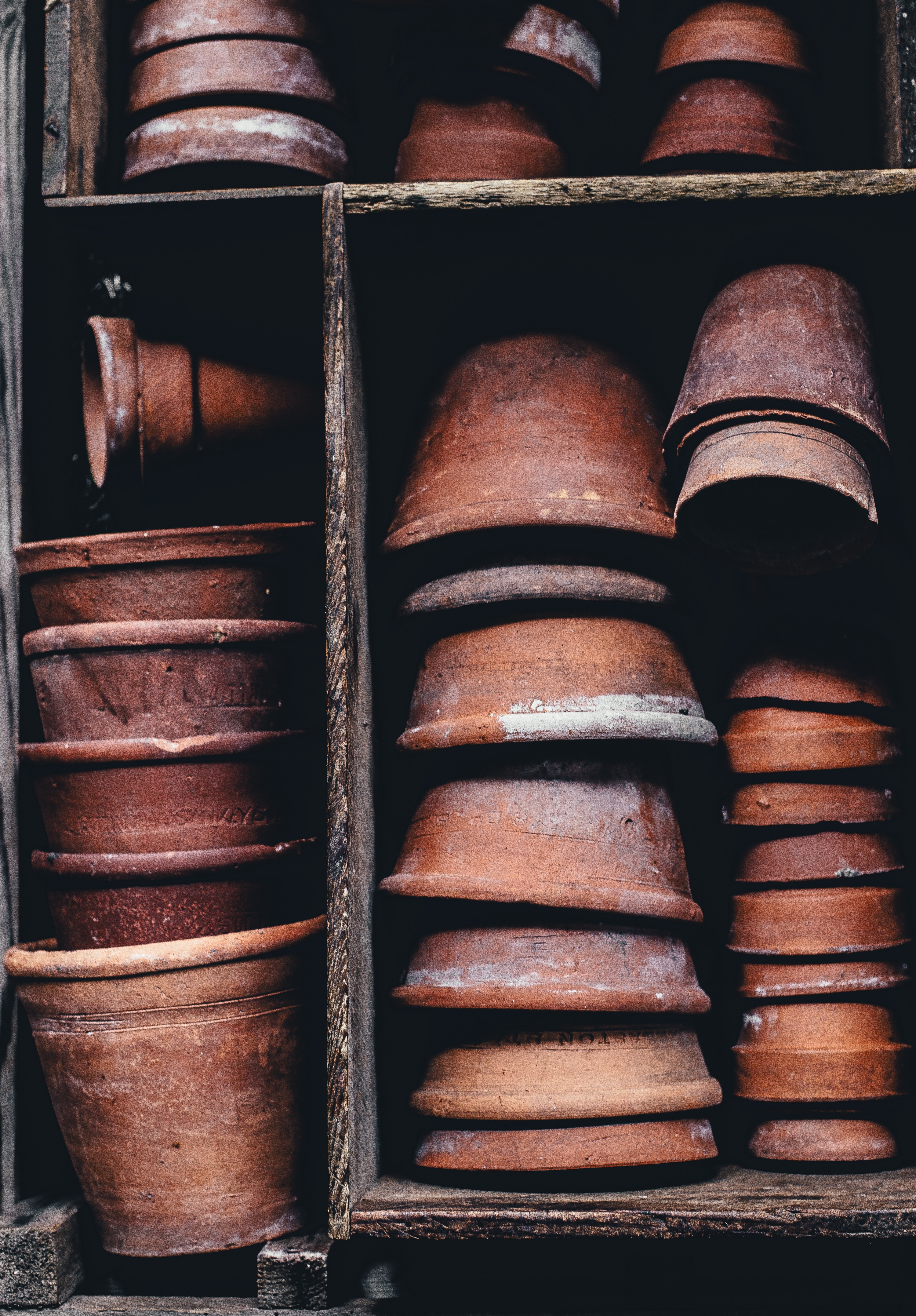
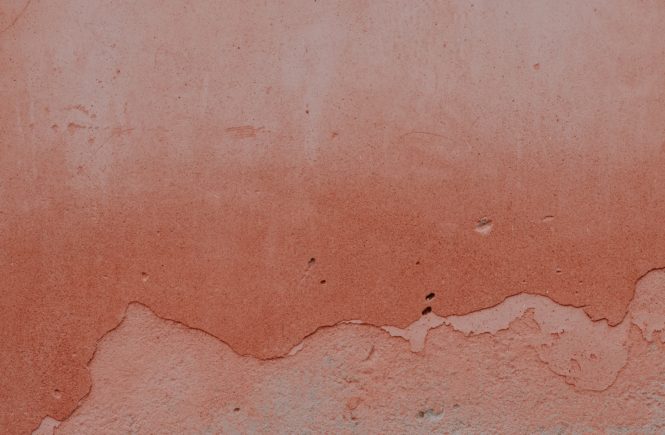
And so the all-important accent colours to ground our new neutrals? Deep earthy terracotta (literally meaning ‘baked earth’), sensuous peaches, golden greens and autumnal browns, with a hint of spice, including mustard, Michelle Ogundehin’s “trope of hope” for 2019. It is these accents that bridge the gap and provide the richness of experience between the exterior chaos and the quiet calm, neutrality that we crave.
New neutrals moodboard:
New neutral palette via Nest Design
Terracotta ‘baked earth’ pots
Jotun’s Calm themed palette
The home of Sarah Van Peteghem, founder of Cocolapine blog
New neutrals palette via Irene De Klerk Wolters
Living room neutral palette via Saar Manche
FRAMA via Celestial Objects
Jotun’s Raw colour theme
How do you feel about the new warm, earthy neutrals?
Do they make you feel more relaxed, calm and at ease?