"Let me bathe my soul in colours; let me swallow the sunset and drink the rainbow"
Kahlil Gibran
A lot of my time recently has been spent thinking and talking about colour…the science behind the effect it has on the atmosphere around us and how our surroundings make us feel. Colour is used in public spaces to inspire an emotion, a feeling, an action or a reaction.

Looking ahead, 2019 heralds the Year of the Pig in the Chinese lunar calendar, traditionally seen as a sign of peacefulness and compassion, and specifically in 2019 is anchored by the depth and stability of the earth element. Aspects that collectively we are in much need of after an unsettling period of unrest and change over the past months, and recent years.
Earth is tied closely to yin energy and has a feminine quality, turning inwards for quiet introspection, reflection and meditation, a layering and depth that helps to absorb negative energy. Earthy yin energy honours the purity within pleasure, an enjoyment and appreciation for simplicity.


As well as the earth element, the Pig has watery connotations, and according to the ethos of Chinese five elements, these should be balanced with the opposing elements, of fire and metal. The elements are also intertwined with symbolic colours, with fire represented by tones of red, orange and pink, and metal by a golden white.
Balancing the yin, earth energy of the Pig with the beneficial, yang elements of fire and metal is said to aid in opening new perspectives and asserting creativity after a period of patient inward reflection.
Synchronously, Pantone, the colour authority has announced a new collection of iridescent shades, such as ‘Ice Palace’ and ‘Golden Egg,’ which perfectly tie in with the fire/metal aspects the Year of the Pig encourages us to embrace. It’s true that metallics (especially of the warm variety) have enjoyed a recent resurgence in interiors, yet metallics have a rich history, according to Artsy, mostly due to gold’s association with ancient religions and deities; Egyptians used gold leaf to line tomb rooms and artists in the Middle Ages applied it to religious painting and church interiors. But our attraction to shimmering surfaces goes beyond their religious connotations and luxurious associations, to an innately biological need for water, with the optical cue of gleaming reflections from metallics magnetising us to iridescent surfaces.
Even more notable than Pantone’s new metallic collection is the announcement of its Colour of the Year 2019 – Living Coral. Described as “buoyant, vibrant, effervescent and life-affirming”, it’s shell-pink hue with golden undertones seamlessly naturally slots in to the palette ordained by the Year of the Pig. Much like the positive yang properties of fire and metal colours, Living Coral is said to promote warmth, connection and comfort in our continually shifting environments.


Whether it is our foremost need for water or indeed to balance the elements, the Year of the Pig alchemises a need for both analytical introspection with discovery and existential exploration. Bring aspects of red, orange, pink and golden metallics into your home during the Year of the Pig to bring fortune, warmth, purify and strengthen; blending to invigorate and balance the wood, water and grounded Earth energy of the Pig.
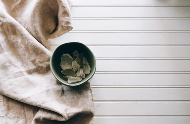
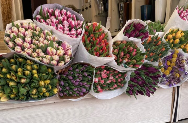
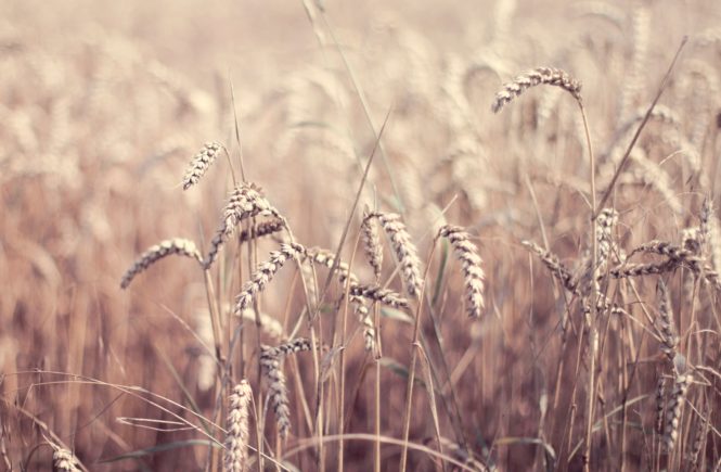
2019 colour palette moodboard: