September marks the start of the new design year in the UK with London Design Festival taking place during the third week of the month. It is an exhilarating time for design lovers with international brands launching new collaborations and their latest collections at the ever-growing array of festivals and design districts that pop up around the city. I am fascinated to see that a number of the latest launches, particularly in relation to colour, are inextricably tied to nature.
Shades of green.
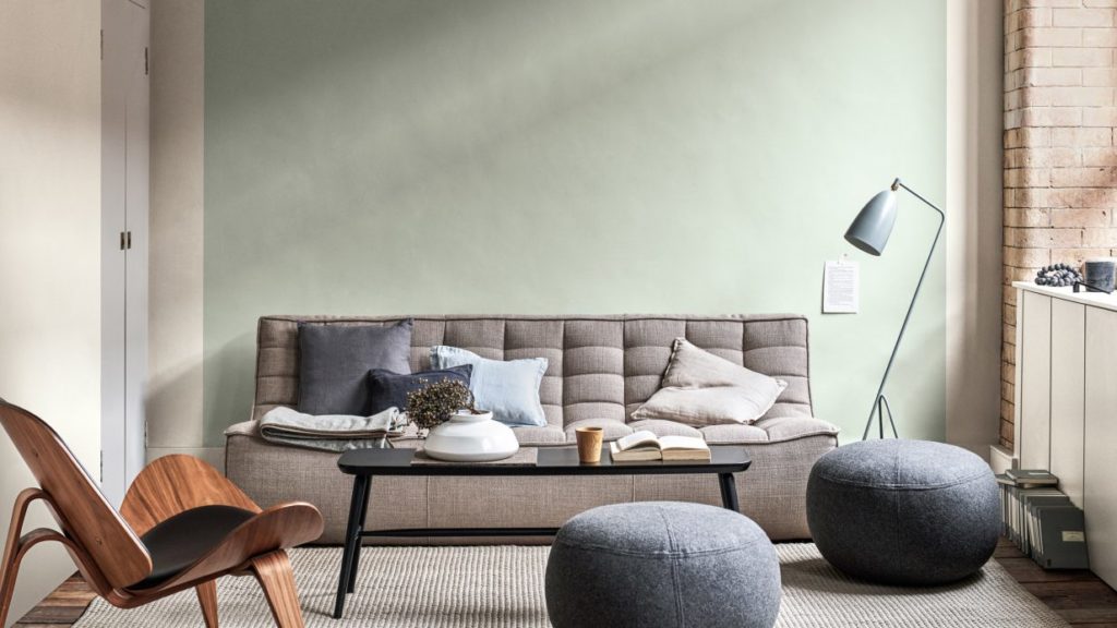
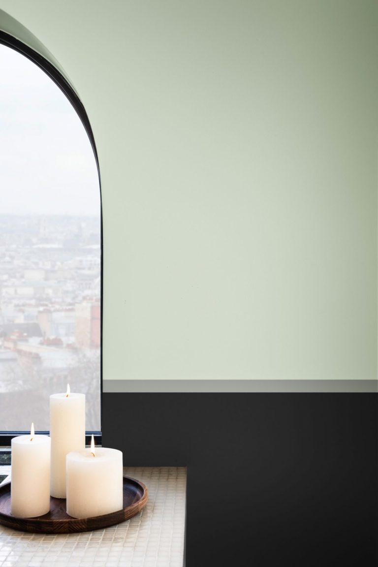
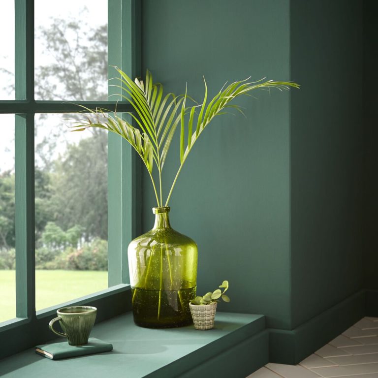
First up, paint brand Dulux launched its Colour of the Year for 2020, a cool, calming hazy shade of green called ‘Tranquil Dawn’. The colour intends to remedy our increasing state of disconnection in society, which the brand puts down to advances in technology. Tranquil Dawn is also a nod to the elements and the natural landscape, representing “the space between land and sky on a misty morning” according to Marianne Shillingford, Creative Director of Dulux.
The decision was made by an expert panel after around 18 months of research who look at key colours emerging in design and fashion but also at cultural, social, political and economic factors. It emerged that we are living in a state of anxiety about the rapid digitisation of the world with the rise of robotics, coupled with a concern for the state of the planet. On a purely visual level, green is a colour that is associated with renewal, harmony, peace, vitality, growth and safety.
Tranquil Dawn, Dulux's Colour of the Year 2020
Tranquil Dawn, Dulux
One of the panellists, design consultant, design writer and TV presenter Michelle Ogundehin noted that the colour signifies more than a trend and represents a “a bigger-picture societal shift” and a realisation that the way we are living is not sustainable. Ogundehin also makes the point that green is grounding, she says. “if you put someone in a space that is filled with greenery, it will have an impact on their body, just like walking in nature has an impact on your body.”
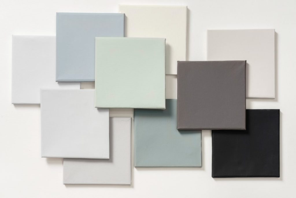
Dulux's Tranquil Dawn calming palette
Biophilia – nature & wellbeing.
The choice of green also links to the current interest in biophilic design, based on the principle that humans have an innate connection to nature, which is key to increasing wellbeing within a space. Richard Louv, author of ‘The Last Child in the Woods’ says that, “the more high-tech we become, the more nature we need” and prescribes nature to treat a range of modern afflictions. Studies have shown that introducing natural colours, textures and materials can have a positive effect on people’s mental health and wellbeing.
Trend forecaster WGSN predicted a similar colour, Neo Mint for 2020 back in 2018 for very similar reasons, that green is “an oxygenating, fresh tone that aligns science and technology with nature”, according to WGSN’s Colour Director Jane Monnington Boddy.
The affinity with nature doesn’t end here and it seems that we are embracing colour to make us feel good and to provide supportive, nurturing and nourishing surroundings in our homes. Colour is hugely personal and subjective, having a direct impact on how we feel in a space. Many of us are looking to nature-inspired, earthy grounding tones as an antidote to our hectic, always-on lives. Nature-inspired tones activate our parasympathetic nervous system (PNS) or ‘rest and digest’ mode which is the state that we want to be in for the majority of the time.
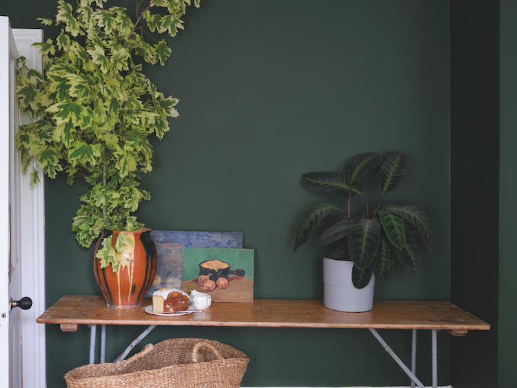
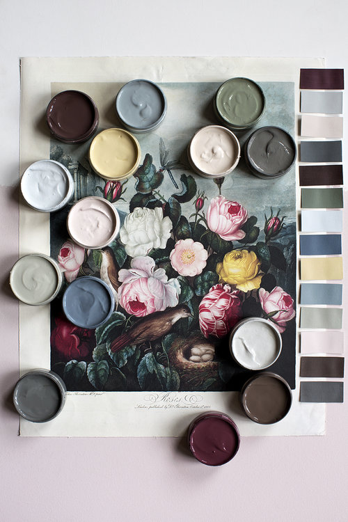
Duck Green from Colour by Nature, Farrow & Ball and Natural History Museum collection,
Farrow & Ball has launched, Colour by Nature, a new 16-colour collection in collaboration with the Natural History Museum, global authority on nature, conservation, and scientific discovery. The Colour by Nature collection is inspired by Werner’s Nomenclature of Colours, published over 200 years ago. It was a ground-breaking classification of colour in nature that recorded the exact hues and corresponding parts of animals, vegetables and minerals from across the natural world, becoming a treasured resource for scientists and artists alike.
The eco-friendly collection of water-based paints features a number of botanical greens and warm, grounding brown tones that complement the trend for warmer earthy neutrals that I explored earlier in the year. Joa Studholme, Farrow & Ball’s colour curator says, “the laid-back nature of these shades creates rooms that feel as if they have been that colour for ever…their warm tones are particularly on trend for those who want to add richness and drama to a space.”
Broccoli Brown from Colour by Nature, Farrow & Ball and Natural History Museum collection,
The 12 new colours from Norwegian paint brand Jotun Lady also underpins the trend for subtle yet deep nature-inspired tones for 2020 and the new decade. The new colour chart represents the hope, optimism and aspiration that a new decade brings. Lisbeth Larsen, Jotun’s Global Colour Manager says, “each of us seeks to thrive in our everyday lives. Colour can be one of the simplest and most effective routes to creating an environment that inspire us.” Many of the colours within the new palette embody how nature inspires a nourishing environment that provides a grounding base that is both stabilising and inspiring.
Exhale from Jotun Lady 2020 colour chart
Local Green from the Jotun Lady 2020 colour chart
Lastly, encapsulating the colourful manifestation of our need for nature, is Human Natura, a collection of 14 new hues by Atelier Ellis, created in response to “the deep connection between people and nature”. Anchored in the human experience, each colour draws on thought-provoking ideas, the essence of sacred personal places, inspiring individuals and the bounty of the natural world.
Human Natura collection from Atelier Ellis
Birds Nest from Human Natura by Atelier Ellis
Can you feel a connection between nature and your wellbeing?