“Colour is a power which directly influences the soul.”
Wassily Kandinsky
I can’t believe it is over a year since I wrote my first post, THE 2019 PALETTE – according to Eastern astrology. It was all about the colour landscape for 2019 according to the Chinese astrological calendar/Feng Shui principles and how this seamlessly tied in to various colour trends we were being pointed to by trend forecasters and global paint and colour research companies.
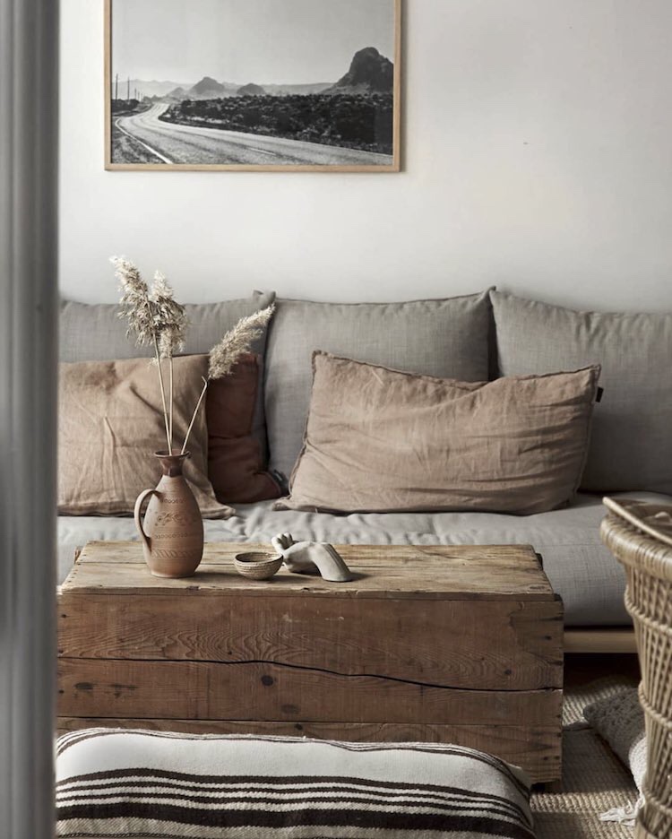
It is interesting to see how it panned out and although I don’t think that Pantone’s controversial ‘Living Coral’ or Dulux’s ‘Spiced Honey’ took off in any major way, there was certainly a shift towards warmer, earthy colours.
Earthy palette via @myscandinavianhome
The Palette for 2020 – Year of the Rat.
The beginning of the Chinese New Year, based on the lunar calendar falls on 25th January and heralds the Year of the Rat. Although not seen as the most desirable animal in the West, the Rat has a number of attractive attributes according to Chinese philosophy, such as community-mindedness, a sense of diligence and resilience, whilst being flexible and quick-witted.
The Rat is associated with the metal element in Wuxing, the Chinese five element system, with an undertone of watery energy, as metal is thought to ‘birth’ water. The combination of elemental cycles in 2020 makes metal a yang element, i.e. it has an outward masculine energy, displaying strength and power. The colours associated with metal and water are gold, white, green and blue and it is thought that bringing these into our lives is auspicious in 2020.
A basic tenet of Chinese philosophy and elemental wisdom is to create harmonious balance and so in a metallic, watery year, it is important to bring in the warmer, complementary elements of wood, fire and earth, which ties in with a continuation of 2019’s earthy palette.
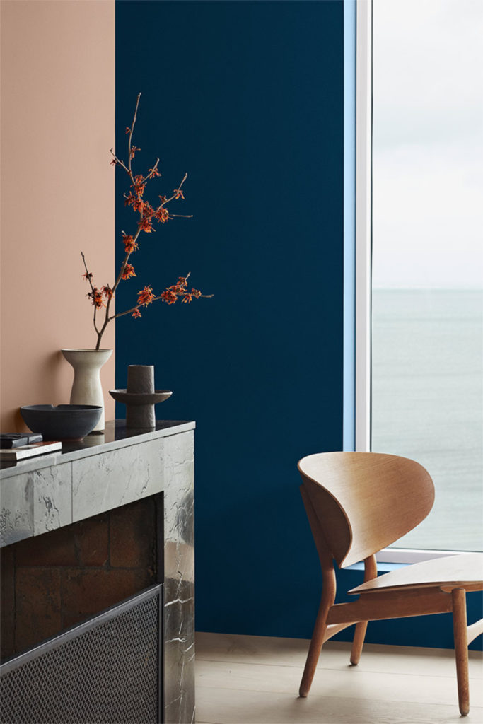
LADY 4863 Statement Blue & 2024 Senses via thatscandinavianfeeling.com
Fortune-filled colour trends.
I wonder if it is a coincidence that two of the key fortune-filled colours for the Year of the Rat also happen to be the two colours heralded as Colours of the Year (COTY) according to global brands WGSN, Pantone and Dulux. The COTY is a universal colour chosen by a panel of experts that aims to represent the mood across cultures and is responsive to society as a whole.
Feeling blue.
First up is Pantone’s Colour of the Year – Classic Blue, described as a “reflective blue tone” that “fosters resilience” and is “an anchoring foundation”. It has been long-established by scientists and psychologists that colour has an effect on the brain and plays a role in human behaviour, with blue widely believed to represent calmness and serenity. According to Leatrice Eiseman, executive director of the Pantone Colour Institute, Classic Blue is “a boundless blue evocative of the vast and infinite evening sky” while also being a colour that challenges us to “think more deeply, increase our perspective and open the flow of communication”.
Interestingly, as a side note, blue is also the colour linked to the throat (or vishuddha) chakra and is the colour of self-expression, creativity, communication, truth and purpose. In the ancient chakra tradition, it is thought to have a pacifying effect on the nervous system and to give us wisdom that comes from a clarity of mind.
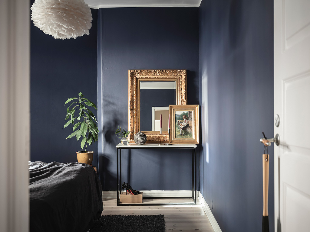
Blue bedroom detail via cocolapinedesign.com
As well as its calming qualities, blue is renowned for being a steady colour of trust and honesty – attributes we are longing for in a restless world and during a period of global political, economic and environmental instability.
In an unsettled global climate, blue is a popular colour among leaders, expressing stability and authority with humility. Going back to the 1800s, blue has always been thought to promote trustworthiness and productivity and is the colour that dominates company branding in the technology, financial and medical sectors (in contrast to red which is often associated with power, danger and risk).
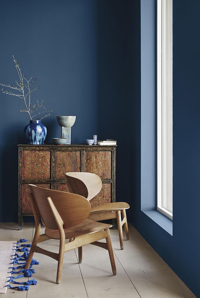
Classic Blue therefore, is a colour that is both bright and optimistic, whilst having a calming effect. It is complementary to the majority of other colours and can be seen as a base tone, creating a starting point for a scheme.
Statement Blue by Jotun, photography - Line T. Klein, styling - Kråkvik & D’Orazio för Jotun
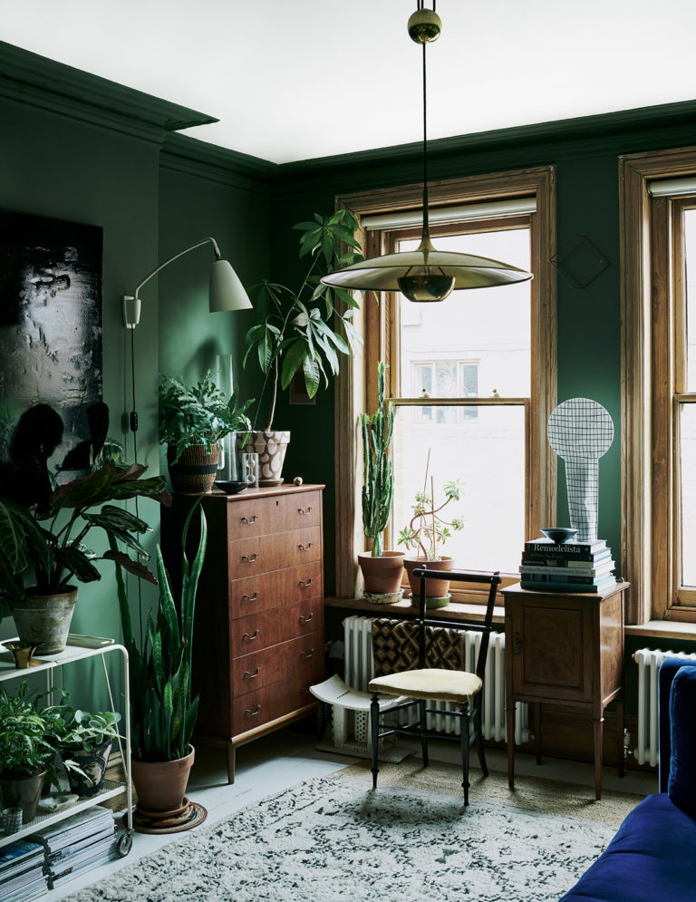
Green shoots.
As mentioned earlier, ideally we are looking to balance the yang metal element with complementary elements including earth, fire and wood. Green bridges the gap, being already auspicious for the year whilst also having the earthy, woody qualities that are required to balance out the metallic nature of the 2020 Rat.
On a visual level, green is a colour that is associated with renewal, harmony, peace, vitality and safety. The colour green signifies Spring and in Chinese culture stands for steady and healthy growth chi energy. As well as the energy of growth and action, green has an incredibly therapeutic effect – there is nothing more grounding and rejuvenating than surrounding yourself with green fields, woodland or a forest canopy.
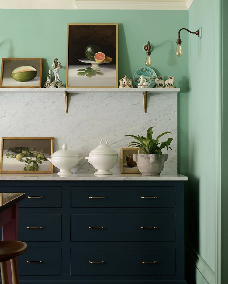
Stylist Laura Fulmine's East London apartment as featured in ELLE Decoration UK
Green’s obvious association with nature, regrowth and rebirth reflects an urgent need to address the environmental agenda and a reconnection with the natural world. As well as a necessary move towards sustainability, the benefits of bringing nature into our homes is also reaching the mainstream. This connection with nature feeds in to another key design trend, biophilia, i.e. bringing physical and symbolic elements of nature into the home to facilitate our own healing.
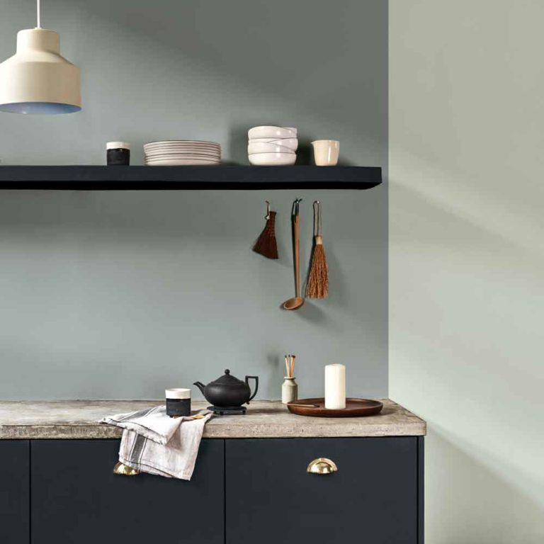
Back in 2018, global trend-forecaster WGSN named Neo Mint its COTY for 2020 – a clean, fresh, cool shade of minty green. According to the forecaster it is a gender neutral colour that has evolved from the popularity of ‘millennial pink’ with “an oxygenating, fresh tone that aligns science and technology with nature”.
Neo Mint in the Devol kitchen showroom, New York via madaboutthehouse.com
Following Neo Mint, Dulux unveiled ‘Tranquil Dawn’ as its COTY for 2020, another cool green shade with a softer, hazy feel which, in contrast to Neo Mint aims to remedy our disconnection in society, which Dulux puts down to the rise of technology. Tranquil Dawn is a nod to the elements and the natural landscape, representing “the space between land and sky on a misty morning” according to Marianne Shillingford, Creative Director of Dulux. Therefore,it seems that the choice of green aims to reflect the sustainability agenda with a realisation that we are not disconnected from nature and rather that we need it to feel grounded, connected and to thrive.
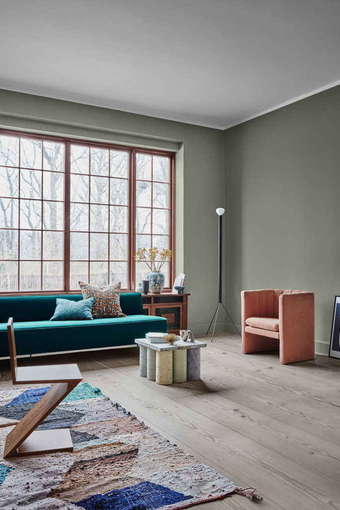
In keeping with the ancient Chinese ethos of achieving balance, pairing this year’s cool colours of blue and green with warmer earthy tones will create the ideal interior for 2020.